Korpus Grotesk
Korpus Grotesk
The development of the Korpus Grotesk typeface was inspired by intermediary devices, primarily those with technical characteristics of phototypesetting. Inaccuracies and fuzziness in the transmission through exposure onto the carrier medium of film and printing plate — as, for example light bleeding — are rendered discretely visible, relativize the character of the font body (Schriftkörper) and shape the design.
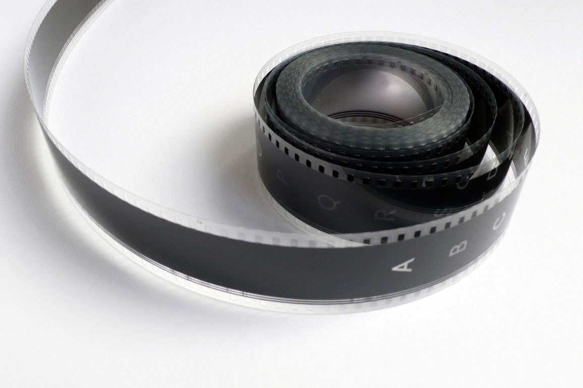
The cinematic work Korpus Grotesk makes reference to this exposure technology, uses film as its transport medium and the light for the illustration, thus, in its very own way also stands as a homage to the cinematographic reproduction technology.
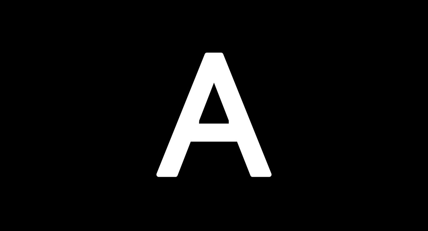
The eye operates with such amazing precision that individual film frames can be read. Nevertheless, when the content in their sequence becomes too different, the perception of the actually projected content is stretched to its limits. Shown in individual frames, the alphabet is something we can only assume while placing trust in its reproduction. The 25 frames per second are rendered a visual challenge. Additionally, as the spoken alphabet is condensed into one second, it loses its contours. The story, however, still remains complete; it is interpreted, which makes for the beauty of this film: Not everything needs to be perceived or shown, we fill in the missing parts through interpretation in our heads.
On the one hand, film is imagination; on the other, it is based on the principle of kinetics. This provides a fruitful starting point for the development of poetic machine-aided works that make reference both to aspects, the metaphysical and the mechanical one.
Nik Thoenen
Korpus Grotesk
2013
Austria
0 min 23 sec


